
Volunteering Made Easy.
Hi-Fi Prototype
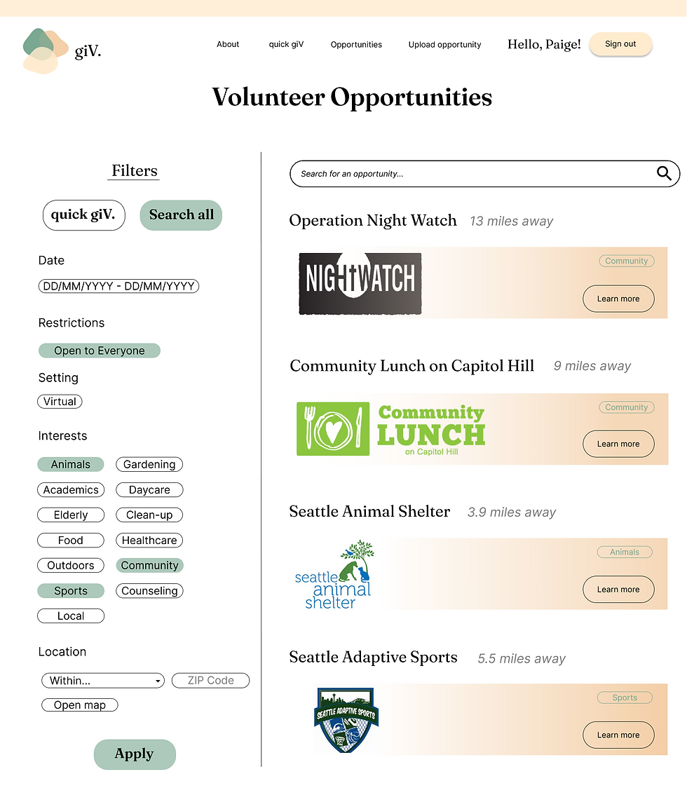
Through user research, developing low fidelity wireframes, and conducting usability testing allowed us to iterate our product to better satisfy our targeted user needs where we were able to finalize our high fidelity interactive prototype that focused on three main user flows: volunteering opportunity sign up process, user profile navigations, and chatting function with organizational members. Below we have included few frames from the high fidelity protype and the link to the prototype.

From the usability testing, we noted down positive feedback and improvements that the users would like to see in the high fidelity prototype.
Strengths:
-
Design and layout of the pages were clean and easy to follow
-
Good use of space, text and buttons were spaced well and located in places that users would prefer intuitively
-
The filtering option on the opportunity search page were useful for narrowing down volunteering events
Improvements to be made:
-
Uploading a volunteering opportunity can be confusing and tiring
-
Additional information on our website is needed
-
Pages are missing some features


After synthesizing the user feedback we have received, we made adjustments to the information layout, adding additional content, and ensuring that the design/pattern/features are consistent throughout the high fidelity prototype.
The creation of the high fidelity prototype followed the design goals that our team had in mind:
-
Readability and legibility of website for accessibility, ease of navigation, and to avoid deterring visitors away
-
Welcoming color scheme and layout with simple designs
-
Provide neighborly tones and phrases to sign up for a volunteering opportunity
-
Allow users to build a sense of community with volunteers and companies with similar interests/motivations
-
Ensure ease of mind when volunteering during the pandemic